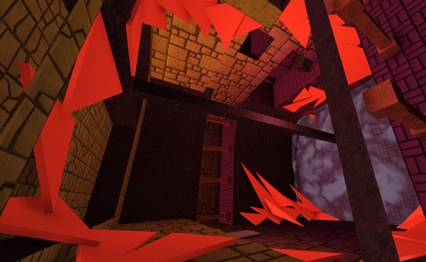
Yes! We are still alive! TRI got a new haircut and for the very first time of the TRI production process I can be sure of this: The first huge goal – making a convincing and playable demo/prototype – is nearly within reach!
But why exactly did it take so long to just tell you that we are still developing and working on our game?!
In the last feature article I wrote about design decisions and story, the latter being the main reason why we just stumbled clumsily around instead of getting the thing done (plus the Indie Buskers jam to earn some money).
Sometimes you have to make things too huge and uncontrollable, so you can get back to the point where the gameplay elements were simpler and more straightforward; elements that are actually needed to present your game and don't obfuscate it's purity. Especially too much focus on story lets you neglect the gameplay.
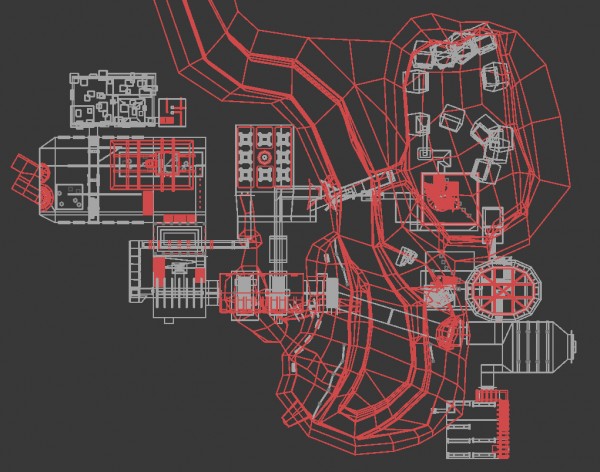
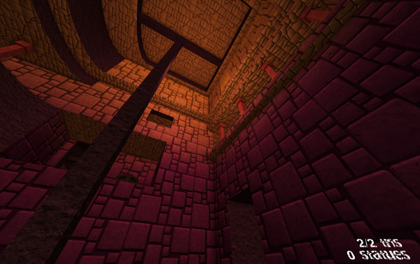
Remember that we already knew what the game would be about. We had this rough idea of a rudimentary story and the game elements were already finished and represented in a prototype. But how to start with the development? We planned the first level the players will visit in the game: A huge canyon that separates the poor people's quarters from the halls of the rich aristocrats. We tried to tell a story with the level style and asked ourselves most of the time: is this level design convincing? Would that make sense? Not for the players to use the triangles, but for what kind of usage those halls and rooms where built by their inhabitants long gone or dead. Our goal was to build a believable, non-linear world without test chambers and buildings that didn't look like game levels BUT a setting that could have been used by human beings to live in.
What become of our over-ambitious canyon level and why did we put this monster in the archive folder? I hope I can give you some learnings with this article, to prevent you from making those mistakes that ate so many weeks of development time.
1. KISS – Keep it simple, stupid!
We are just two people – a programmer (Friedrich) and me (Jana), the graphics artist. We love 3D and first-person games. After resetting the level we already had, we decided to focus more on the level design that is REALLY needed to play our game.
Keeping everything extremely simple to achieve all the goals we have with our game basically means: down-scaling.
To check how complex your game should be: Make a level and monitor how long it takes to design, model, texture, fill the thing with gameplay and test your level. Multiply it with the number of levels you want to have in the end and check if you have the money and time to develop it.
What we want to achieve with TRI is an awesome, playable, mostly intuitively to understand game that looks good. But our emphasis lies on gameplay. That means that we design everything for you – the player – to look nice and fun to explore, but it won't have high-end cutting-edge graphics. It won't contain super non-linear level design. And most parts of the story will be told by the environment and books to be found in the world, and not by elaborated NPCs with facial animations.
The decision we made was somewhat hard, but necessary:
>> Learning #1: Everything that takes too long to develop, design or playtest should be cut out!
And additional: Everything, that is no fun at all AND needs to much time, should be outsourced or replaced or crossed out.
2. Recycling is good for you AND the player
This brings us to another learning we earned after fighting with the big-ass monster room:
>> Learning #2: Reuse as much textures and models as possible.
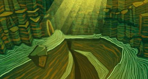
In our canyon level every second room had another texture design. The first had blue tiles. The second violet, the third was yellow. Did you see that our canyon had green textures?
At this time I couldn't see those greyish “coloration” of first-person games anymore. Most of them try to look photo-realistic but with a monochrome filtering. I wanted to have fantastic, colourful-looking, varied level textures. And that's what I did! I guess I tried to use every colour in the rainbow wheel, to present them in our game.
Bad idea! For many reasons:
- The game looked like a drunken clown.
- When I needed to adjust the coloration I had to adjust EVERY texture in this area, which was extremely time consuming.
- Players got totally distracted from everything while the whole world was a freaking highlight.
- There was no colour left over to be used as a colour-code for lights or special game objects.
What did we do for our current level? I'm just using two colours: Yellow and violet. Both are added in Unity, not in the texture itself. When I now decide to change the look, I just change the materials, which is so convenient! The colours are very monochrome with this technique and I'm not fully satisfied. But players can concentrate on the gameplay and I can later change everything much easier this time.
This is the reason why you should use prefabs (reusable game objects) as often as possible. Although many of them can or should be just placeholders at the beginning. As early as they exist, you can use, discuss and change them as you like. It's time saving and you keep up a clean and harmonized look.
3. Better Zelda than Skyrim
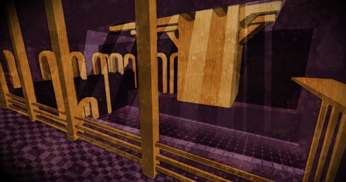
Zelda always got great level designs. But the more I read about level design, open world, sand box, Minecraft, etc., I began to hate level designs that looked like games that much. This led me more and more to the canyon monster level we build. The problem is that this kind of “realistic” levels totally limits your imagination what cool things a player could craft, enjoy, build or experience. Because we always pondered if an element we just added is logical or convincing.
But after building new levels without any restrictions or logical architectural building backgrounds we had more fun making those levels, and faster too! The approach of being realistic is even more stupid when you remember that you are creating triangles and walk on the walls – how realistic is that? Of course you should not break the rules you are building in your little world. But it's always better to not getting stuck in realism. Especially with photo-realism and a team of two!
>> Learning #3: Build the worlds you like. Just try to be consistent.
4. Consolidate your workflow
Although we are just two people working in one room next to each other, we had to define some rules to improve our pipeline and teamwork. We are now using a local SVN repository for TRI. SVN is a program for file sharing and version management. Which means that we are not just sporadically exchange some assets and stuff from time to time; instead we share everything, instantly. Since we established this we just have to update our repositories and start Unity in order to work with the latest version. A real time-saver (although there are some quirks with Unity), even for a small team.
We also decided to use a grid for the rooms. No strangely modeled rooms with thousand subdivided edges, but the rule to make every vertex divisible by 0.5 units. Sounds very rigorous? Again, this helped us to make more clear and harmonious designs. Restrictions like this help saving time, also for texturing. And players are more secure in those levels, because they intuitively know how they can place their triangles, or how far or high they can jump.
>> Learning #4: Simplify and structure your workflow. Little rules can make things easier.
5. Testing!
One really big problem we had with our first/last level: We didn't test it enough. Friedrich built one room after another and I was blindly texturing them, eager to just getting things finished. We planned to let testers walk the rooms, when everything was finished …
>> Learning #5 Test as early as possible!
I know that testing the game is something very basic. You should know this as a developer! We knew this from our last games Pitman, Tumblox and The Sun Is Deadly, which were all too hard at the beginning. And I learned this through the game jams we regularly participate in. But with TRI it seemed that I needed to learn this again. Texturing and filling the room with little decoration gimmicks makes sense, when the players was successfully sent through the whole testing area.
To explain our strange behaviour this time I have to admit that the whole gameplay was just available for Friedrich (SVN was already there, but only used by him) and most parts of the gameplay were not integrated into prefabs. Having the game components (light rays, switches, character controller, doors, etc.) as easily to place game objects made things so much easier.
Again: keep things smaller, even the level structure, game elements and possibilities. That doesn't mean that you should add one collision box one after another in a cubical level structure. But it was more fun since we decided to be creative in the restrictions we set for ourselves. The game is better structured and far more understandable since then.
I guess the most important learning is:
>> If working on the game is no fun at all, it's time for a down-scaling!
And what is the next step for us? We TRI to present you a huge demo and more wordplay this June.
Genau das haben wir auch gerade gelernt, und alles nochmal reduziert :D irgendwie versteht man es nicht, wenn man es nicht selbst gelernt hat.
Danke für die guten Tipps. :)
Bitte weiter so gute Posts